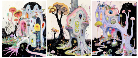
1.The principle of balanced color matching
2. Understand the charm of classic colors
3. Keep up with the trend of color and fashion
4. Cleverly integrate classics and trends
5. Practical Tools and Resources
6. Conclusion
Introduction
“Color is the power to wear on the body !”
The importance of color in design is self-evident. Both classic and trendy colors can add unique charm to a work. However, finding a balance between classics and trends is a challenge faced by many designers. In this article, we will explore several practical color matching techniques to help you navigate between classic and trendy styles with ease.
1.Principle of balanced color matching
Balanced color matching emphasizes the harmony and balance between colors, making the design work look more coordinated and comfortable. Here are some principles for achieving balanced color matching:
1. Use of color wheel:
The color wheel is a fundamental tool for color matching. Through the color wheel, complementary colors, adjacent colors, and triangle color schemes can be found to achieve balance between colors. For example, complementary colors (such as red and green) can create a strong contrast, while adjacent colors (such as blue and green) are more harmonious.
2. Color ratio:
In design, a reasonable color ratio can avoid visual fatigue. The proportion rule of 60-30-10 is usually adopted, which means 60% of the main color tone, 30% of the secondary color tone, and 10% of the accent color. This ratio can ensure the harmony and layering of colors.
3. Tone consistency:
Maintaining consistency in color tones can enhance the uniformity of the design. Whether in warm or cool tones, consistent color tones can make a work look more professional and coordinated.
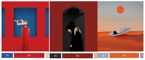
Classic colors such as black and white, gray, navy blue, etc. are highly favored for their simplicity and timeless qualities. These colors are usually not limited by time and can blend with various design styles, making them a reliable choice in any design work.
Example
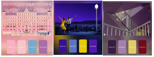
The distinct and layered visual presentation effects in famous films such as the Grand Budapest Hotel, La La Land, and Florida Park can quickly establish the emotional tone of a film, convey emotions to the audience, and mobilize the emotions of the viewers. This is not only applicable in the film industry, but also in the fashion and design industries, where the charm of color matching can be used to showcase different visual characteristics.
Every year, new color trends emerge that inject freshness and vitality into designs. Pay attention to trendy color trends, which can keep your design works up-to-date and maintain a modern feel.
Example
Popular colors such as vibrant orange and fresh green, which are popular this year, can bring a sense of fashion to the design.
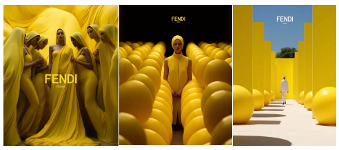
4.Cleverly integrate classics and trends
Combining classic colors with trendy colors can create a stable and vibrant color scheme. This method not only makes design works timeless, but also captures the essence of current trends.
Based on classic colors: Classic colors are used as the main color in the design, supplemented by trendy colors as embellishments.
Gradient Transition: Use gradient colors to naturally transition classic and trendy colors, adding a sense of layering.
Color ratio: Reasonably control the ratio of classic colors to trendy colors to ensure visual balance.

5.Practical Tools and Resources
Modern design tools and resources can help designers better achieve color matching. For example, color matching websites and applications can provide rich color inspiration and schemes.
Adobe Color: Provides multiple color matching schemes to meet various design needs.
Coolors: Generate and share color combinations, with endless inspiration.
Pantone Color Finder: Convenient for finding and applying Pantone colors.
Pantone Color of the Year: Every year’s Pantone Color of the Year is a trendsetter for color trends.

6.Conclusion
In the balance between classic and trendy colors, the key is to understand the characteristics of each color and skillfully blend them together. Through continuous learning and experimentation, achieving a balance between classic and balanced colors in design requires balancing the historical charm of colors with visual harmony. By using color wheels, color ratios, and neutral tones in a reasonable manner, both classic and modern visual effects can be created. Whether it’s brand design, web design, or interior design, the balance of classic and balanced colors can add a lot of color to a work, enhancing its appeal and durability.
